


Curtain Color Selection: How It Shapes Your Room's Mood
Curtain color selection is one of the most direct ways to control how a room feels. The right hue can make a compact bedroom feel airy, turn a neutral living room into a warm gathering space, or bring a sense of calm to a home office that gets too much afternoon sun. Color works through light interaction, psychological association, and visual proportion simultaneously. Here is what that means in practice:
- Warm tones (reds, oranges, yellows) raise energy levels and stimulate alertness.
- Cool tones (blues, greens) promote relaxation and reduce cortisol.
- Curtain color affects perceived room size, ceiling height, and spatial comfort.
- Coordinating curtain color with walls, furniture, and accent pieces creates a cohesive interior.
- Color acts as an emotional thermostat, shifting mood from morning to evening depending on the palette you choose.
How curtain color coordinates with your wall colors
The most reliable starting point is tone-on-tone coordination: choose a curtain fabric one or two shades lighter or darker than the wall color rather than matching it exactly. An exact match flattens the room. The window disappears into the wall, and the result reads as unfinished rather than intentional.
Wall undertones matter more than the named color. A warm white wall with a yellow or pink undertone will make a cool-white curtain look dingy. Warm undertones pair with warm curtains; cool undertones pair with cool ones. This single principle prevents the most common curtain color mistakes.
- Tone-on-tone: one or two shades lighter or darker than the wall creates depth without visual conflict.
- Contrast strategy: introduce a secondary color pulled from the rug, art, or upholstery for a more deliberate look.
- North-facing rooms receive cooler, indirect light; warm-toned curtains in cream or soft amber compensate effectively.
- South and west-facing rooms with strong afternoon sun benefit from medium or deeper tones that manage glare.
Pro Tip: Tape fabric swatches to your window frame and observe them at different times of day. A color that reads perfectly at noon can shift noticeably by 4 PM under changing natural light.
Matching curtain colors to furniture and accent décor
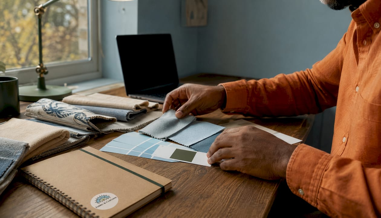
Curtains work best as a connecting element rather than a competing one. The goal is to complement dominant furniture colors, not replicate them. If your sofa is a warm charcoal, curtains in a slightly lighter warm gray or a soft sage create visual continuity without redundancy.
Pulling a color from an existing accent, such as a rug, throw pillow, or piece of wall art, is one of the most reliable coordination strategies. It makes the curtain choice feel purposeful rather than coincidental.
- Echo an accent color from the rug or sofa rather than matching the wall when you are unsure where to start.
- Avoid overpowering existing décor; curtains in a neutral room can carry more color, while curtains in a bold room should support rather than compete.
- Complementary color pairings (opposite hues on the color wheel) add energy; analogous pairings (adjacent hues) feel calm and cohesive.
- Consider the room’s dominant palette as a whole before committing to a curtain color.
How curtain color influences room mood and perceived space
Color triggers measurable biological responses. Warm colors boost adrenaline; cool blues slow heart rate. Because curtains span a large visual surface, their hue amplifies these effects more than smaller décor items do.
Spatial perception is equally responsive to curtain color. Light, cool shades reflect more light and visually push walls outward. Mounting curtains from ceiling to floor, regardless of actual window height, reinforces this effect and makes ceilings read as taller. Dark curtains do the opposite: they absorb light and create intimacy, which works well in a dining room or media space but can feel oppressive in a small bedroom.
- Light, cool tones paired with ceiling-high mounting visually enlarge small rooms.
- Dark, saturated tones create intimacy and drama, suited to spaces designed for evening use.
- Warm palettes lift energy in morning-use spaces; cool palettes ease the transition into rest.
- Layered curtain setups (a sheer plus a blackout panel) let you toggle between moods throughout the day.
Practical curtain color ideas for every room
Room function should guide color choice as much as personal preference does. A bedroom serves rest; a dining room serves sociability. Those are different emotional goals, and curtain color can support or undermine them.
- Bedrooms: Navy, dusty blue, sage green, and soft lavender promote relaxation and signal the brain to wind down. Avoid bright reds or saturated oranges, which stimulate rather than calm.
- Living rooms: Warm neutrals like mocha, camel, and terracotta encourage conversation and feel welcoming without visual overload. A mustard yellow can add warmth to a gray-dominant space.
- Dining rooms: Deep rust, burgundy, and warm gold amplify the existing warmth of wood furniture and create an intimate atmosphere suited to longer meals.
- Kitchens: White, light gray, pastel yellow, and sage green keep the space feeling clean and fresh. Dusty rose works in minimalist kitchens where a soft accent is needed.
- Home offices: Muted sage or powder blue reduces eye strain and supports focus without the sterility of stark white.
For a deeper look at how color transforms window treatments across different room types, Beautifulwindowselgin covers the full spectrum of psychological and visual effects in detail.
How fabric texture changes the way curtain color reads
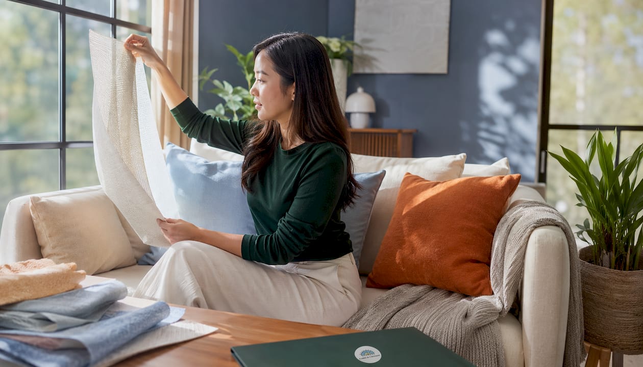
Color choice is only half of the equation. The same hue behaves very differently depending on the fabric it is printed or woven into. Velvet deepens and dramatizes color, making a navy feel almost jewel-like and rich. Linen lightens the same navy into something casual and coastal. Sheer fabrics diffuse color into a soft glow rather than a solid statement.
Undertone matching applies to fabric as well as paint. A curtain fabric with warm undertones hung against a cool-toned wall will look off, even if the named colors seem compatible. Evaluating color and fabric together, rather than separately, prevents this kind of visual discord.
- Heavy fabrics (velvet, jacquard) intensify color depth and suit traditional or dramatic interiors.
- Lightweight fabrics (linen, cotton blends) make the same color feel relaxed and contemporary.
- Sheer fabrics create a diffused, gentle effect; the color reads softer and more ambient.
- Always match fabric undertones to wall undertones: warm with warm, cool with cool.
For guidance on pairing fabric texture with curtain style, Beautifulwindowselgin offers detailed resources on achieving the right interior mood through material selection.
What specific curtain colors do to a room psychologically
Each color carries a distinct psychological profile that interior designers use deliberately. Understanding these associations helps you choose with intention rather than guessing.
- Blue: Signals safety, calm, and focus. Widely used in bedrooms and home offices for its ability to slow heart rate and reduce anxiety.
- Green: Evokes balance and natural ease. Sage green in particular has been noted in design research for its anxiety-reducing qualities in residential settings.
- Yellow: Promotes optimism and sociability. Works well in kitchens and breakfast nooks but can feel overstimulating in large quantities.
- Red and terracotta: Stimulate appetite and energy. Better suited to dining rooms and social spaces than to bedrooms.
- Purple: Conveys luxury and introspection. Deep plum velvet curtains suit a study or library; softer lavender works in a bedroom.
- Black: A powerful anchor color. Black linen curtains in a minimalist or industrial space create sharp contrast and architectural definition.
- Neutrals (cream, greige, taupe): Support timelessness and flexibility. They let furniture, art, and architecture take center stage without competing.
For homeowners drawn to mindful, calm interiors, cool and neutral palettes consistently deliver the most restful results across different room types and lighting conditions.
How seasons and 2025–2026 trends shape curtain color choices
Curtain color is not a permanent commitment in the way wall paint is. Seasonal rehangs and layered setups make it practical to shift the room’s palette as the year changes. Warm, earthy tones in terracotta, rust, and deep olive suit autumn and winter interiors, adding weight and coziness when natural light is limited. Pale blues, soft whites, and sage greens refresh a room in spring and summer, working with increased daylight rather than against it.
The 2025–2026 design cycle favors texture-forward, grounded palettes. Warm neutrals with tactile weaves, earthy mid-tones, and layered natural fabrics are replacing the stark, high-contrast looks of earlier years. Beautifulwindowselgin’s fall window treatment trends coverage details how warmth, texture, and tailored elegance are defining the current season’s most considered interiors.
- Rotate warm, saturated tones (rust, deep gold, mocha) into autumn and winter setups.
- Shift to lighter, cooler palettes (pale blue, sage, off-white) for spring and summer.
- 2025–2026 trends favor earthy, grounded mid-tones over stark minimalism.
- Layered curtain setups allow seasonal mood shifts without replacing hardware.
Key Takeaways
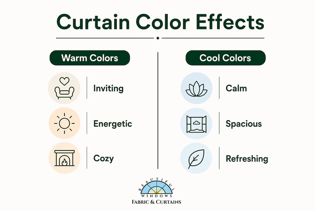
Curtain color selection shapes room mood, perceived space, and décor harmony by interacting with light, fabric texture, and existing interior elements simultaneously.
| Point | Details |
|---|---|
| Tone-on-tone coordination | Choose curtains one or two shades lighter or darker than walls to add depth without clashing. |
| Undertone matching | Warm wall undertones need warm curtain fabrics; cool undertones need cool ones to avoid a grimy appearance. |
| Color and mood | Cool tones (blue, green) reduce cortisol and promote calm; warm tones (red, orange) raise energy and stimulate appetite. |
| Fabric texture changes color | Velvet deepens and dramatizes a hue; linen lightens the same color into something casual and fresh. |
| Seasonal flexibility | Rotating warm earthy tones in autumn and cool pale tones in spring keeps the room feeling current without repainting. |
Bring your color vision to life with Beautifulwindowselgin

Choosing the right curtain color is only as effective as the fabric you put it in. Beautifulwindowselgin offers a curated selection of designer drapery fabrics spanning jacquard satin, embroidered textiles, and upholstery-weight weaves, all available by the yard with nationwide shipping. Whether you are working with a warm terracotta palette or a cool sage scheme, the right fabric weight and weave will determine how that color reads in your space. Explore the full range of custom drapery fabrics and request fabric samples to test your chosen colors in your own lighting before committing.
Recommended
- Curtain Style Selection Process for Custom Drapery Success – Shop Designer Fabrics by the Yard | Curtains & Drapery
- 7 Essential Curtain Fabric Types List for Homeowners – Shop Designer Fabrics by the Yard | Curtains & Drapery
- Today we will discuss “How to choose window curtains.” – Shop Designer Fabrics by the Yard | Curtains & Drapery
- Today we will discuss “How to choose window curtains.” – Shop Designer Fabrics by the Yard | Curtains & Drapery